XY-Plot Settings
A dialog box with settings appears automatically when you open the (x, y)-Plot Window for the first time. Closing the window will save the settings. The next time the window is opened this dialog will not appear again. Instead the saved settings will be loaded.
If you want to modify these settings or carry out a new calculation you can re-open the dialog box using the menu item “Start/View Settings/ Edit” or by clicking “Settings…” in the context menu.
You can also press the F5 key to open the “Settings” dialog box.
Global Options Tab
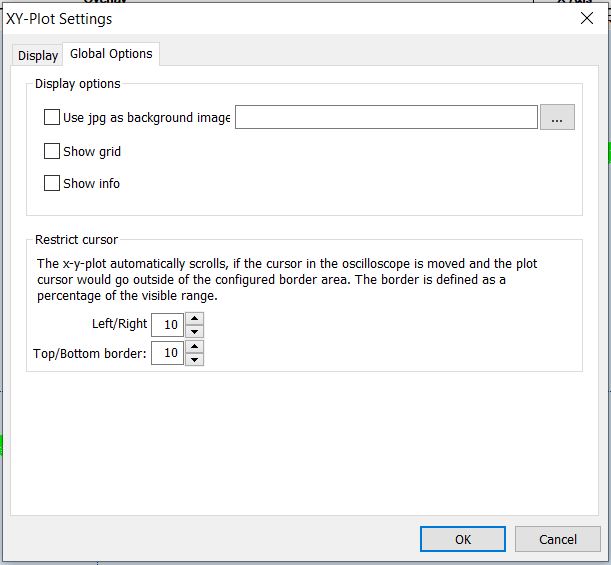
In the global options tab are the options that are regarding all (x, y)-Plots or the window itself.
|
|
Use jpg as Background Image | If desired, you can activate this option and select a jpg-file that you want to have displayed in the Background. Zooming in on the (x, y)-Plot also zooms in on the Picture. |
Show Grid | This option shows a grid in the background. |
Show Info | Shows the Offset and Gain of all the lines (regression lines and user lines) and the correlation of the regression lines. |
Display Tab
This tab is used to show all the existing plots, to manage them as well as setting the data source and the condition, that is applies to the data from the data source.
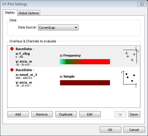
Data Source | Choose the data that is analyzed by the (x, y)-Plot. The combo box offers a wide range of selectable options. |
Overlays & Channels to Evaluate | In this list, you see all the (x, y)-Plots that are currently defined. Every item shows the essential parameters selected for this particular plot. |
Note: If two or more plots have the same x- or y-axis the topmost plot defines the shown range for this axis.
Plot Edit Dialog
This dialog is shown when you mark an existing (x, y)-Plot and press Modify or by
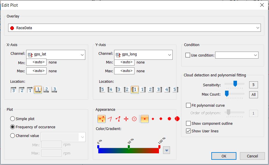
The difference between adding a new plot or duplicating an existing plot is that the fields are filled with default values when adding or with the values from the source plot when duplicating a plot. The plot itself is only created after pressing OK.
Overlay | Choose the overlay from which the data is analyzed. |
x-Axis | In this section, select the channel, the range and the axis-position for the x-axis. |
y-Axis | In this section, select the channel, the range and the axis-position for the y-axis. |
Plot | You can choose between 3 color modes. |
Appearance | Choose the appearance of the plot-samples within the plot-window. First select the form of each sample. You can choose between a various size of dots, a cross or circle.
You can move the sliders by dragging them to another position. Remove sliders by pulling them away from the scale, and create new sliders by clicking inside the gradient. You can also use predefined color scale settings by using the button on the right side of the color scale. |
Condition | You can select a predefined condition or write a new one directly into the field. The data is filtered by the condition before it is being analyzed by the (x, y)-Plot. |
Cloud detection and polynomial fitting | In this section you can configure the regression lines, components and user lines. |
Components and Regression Lines
Components are calculated based on the (x, y)-Plot data to find and visualize connected data samples. To analyze the data, the (x, y)-Plot is divided into a grid. First, the field containing the most samples is set as a starting field of a component. Starting from this field, the surrounding fields are analyzed. If a surrounding field contains more samples than a given threshold, the field is added to the component. Now the surrounding fields of the enlarged component are analyzed and maybe added. This step is repeated until there is no surrounding field with a high enough sample count to add to the component.
Now the next field with the highest sample count outside a previously found component is chosen to start a new component. A new component is being built from this. These steps are repeated until the last component is found.
The higher the sensitivity is set, the finer the grid will be. Also the sample count threshold rises with the sensitivity.
The count sets the maximum number of components. So if the maximum number of components is reached, no new component will be started.
After the components have been found, the regression lines are calculated for each component.
Working with the XY-Plot Window
Basic
In the (x, y)-Plot window, the chosen (x, y)-Plots are shown as overlapping layers. Clicking on the window will show you a cross and the values of the selected dot can be seen in the surrounding axes.
You can zoom in an area of the window and see more details.
Zoom functions:
Press right mouse button and drag down or up. The marked area will be all x-values and only the y-values between the y-start drag and y-end drag values.
Press right mouse button and drag left or right. The marked area will be all y-values and only the x-values between the x-start drag and x-end drag values.
Press Shift-key and then drag a box with pressed right mouse button. The marked area will be x-values and y-values inside of the dragged box.
|
|
Zoom in | The picture will be zoomed in by a factor of 2 so the cross dot will stay unmoved.
|
Zoom out | The picture will be zoomed out by a factor of 2 so the cross dot will stay unmoved.
|
Show All | To show all dots:
|


Additional Elements
There are components, regression lines, user lines and an InfoBox with the information about the files and lines. They are additional to the base picture. Additional elements can be hidden and shown from the menu or the toolbar.
Show Info | The InfoBox contains information about files and user lines. Information for every file consists from files ranges, correlation of the range and file regression lines. Information about file lines can be shown or hidden by using +/- in front of the file name. Every line has offset, gain and correlation.
|
Show Color Scale | Displays or hides the color scale for the selected (x,y) plot in the (x,y) window. This is only available in frequency or channel mode.
|
Background Image | Select and use an image for the background of your (x,y) plot.
|
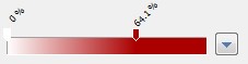
Transparency | Shows/Hides the selected (x,y) plot (press h). You can adjust the transparency of the (x,y) plot by clicking on the drop down button and change the slider position or by using hotkeys (0-9) to set the transparency (0% - 90%).
|
Components | Components are continuous regions with approximately the same density of dots.
|
Regression Lines | Regression lines are calculated and they depend on calculated components. For every regression line there is a correlation. Press Space Context Menu/Regression Line Go to start/Clouds and polynomial fitting/Fit polynom
|
Show/Enable User Lines | User lines are free placeable lines that are inserted into a (x,y) plot by the user.
|
Add User Lines | Adding a new user line is done by pressing Insert-key or “Insert line” from the menu. To add a user line, user lines must be showing. The inserted line is going through the (0, 0) and the cross point. A user line can be dragged using two small rectangles on the line.
|


Lines
If the mouse cursor is near a line then the equation of the line will be shown in a small window. The information about the lines can be seen also in the InfoBox. You can select a line by clicking near to the line or by clicking in the InfoBox on some row with line information. If the line belongs to the component the component will be selected too.
|
|
Delete User Lines | You can delete the selected line and component.
|
